Back to portfolio
From Concept to
Conversion: Identity
& Product Experience
for BTQ Finance
2025
Project overview
BTQ Finance is a fintech service focused on crypto and fiat operations without geographic barriers. The product needed a complete visual and communication system - from brand identity to landing and acquisition creatives - to support launch and investor communication. My role was to lead the design direction and build a consistent brand and UX foundation across all touchpoints. The goal was not only visual consistency, but clarity, trust, and conversion support in a high-risk, low-trust market category.
Problem & User Need
Fintech users make decisions quickly and cautiously - trust, clarity, and perceived stability directly affect conversion. BTQ Finance had no visual language, no structured messaging, and no unified presentation layer for partners or users. The challenge was to create an identity that feels secure and modern while remaining flexible for marketing and product growth. It also had to work equally well in pitch decks, social content, and landing UX without fragmentation.
Solution
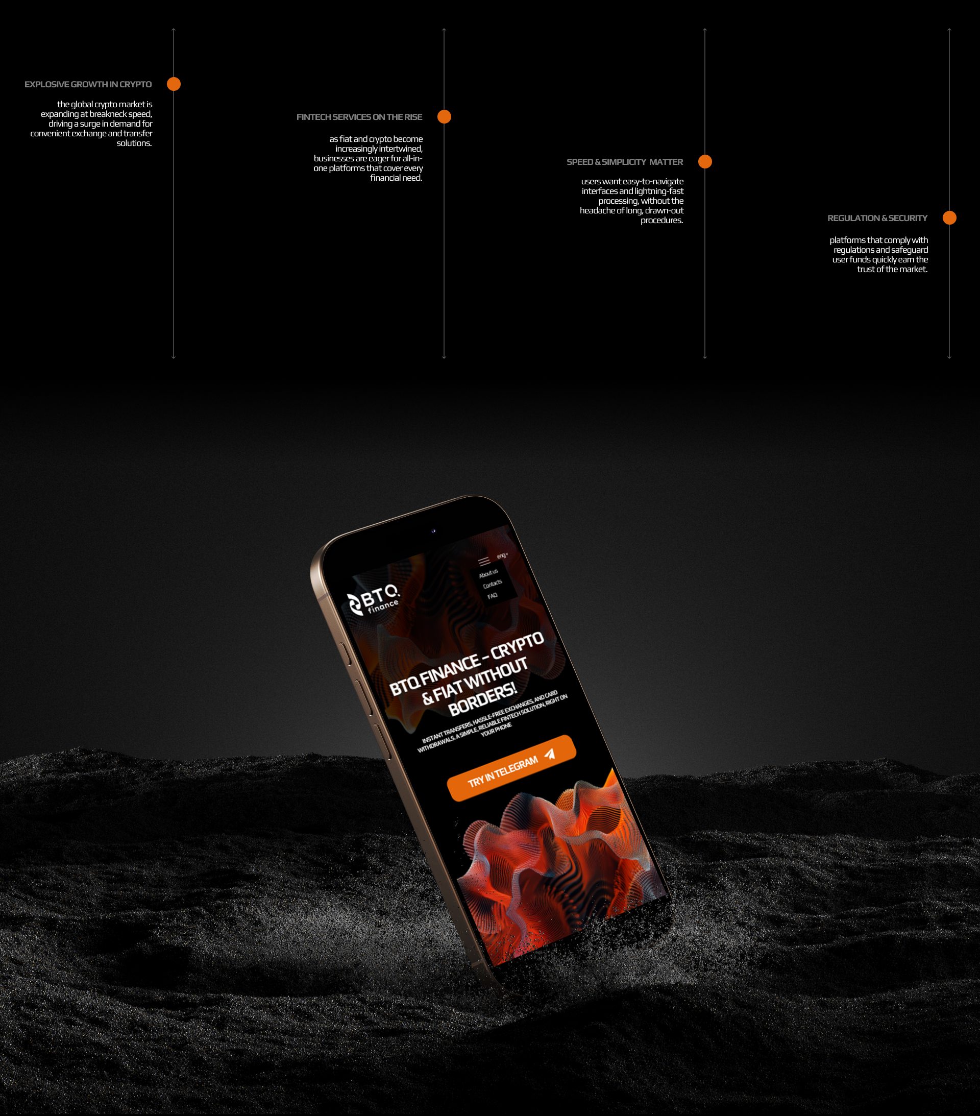
I delivered a full identity system: logo, color palette, typography pair, graphic elements, and usage rules. I designed presentation templates for partners and investors to ensure message clarity and visual consistency. I created a conversion-focused landing page structure with strong value framing, benefit blocks, and action-driven CTAs. Social visuals and ad creatives were built as a flexible system, allowing fast campaign production without breaking brand coherence.
Reflection
This project strengthened my approach to designing for trust-sensitive domains where clarity and structure matter more than visual novelty. If repeated, I would add earlier user validation on messaging blocks and CTA phrasing through quick testing. The key takeaway for me: brand and UX should be built as one system, not as separate layers.